ESEN – Design system
Product
SaaS
Industry
HealthTech
Our participation
UX Research & Design Audit
UX/UI Design
The main goal of creating a design system is to ensure a consistent and cohesive visual language across all products, which enhances brand recognition and user trust. It streamlines the design and development process by providing reusable components and guidelines, improving efficiency.
Additionally, it facilitates better collaboration among team members, ensures scalability for future updates, and maintains high-quality, user-friendly interfaces, resulting in a unified and seamless user experience.
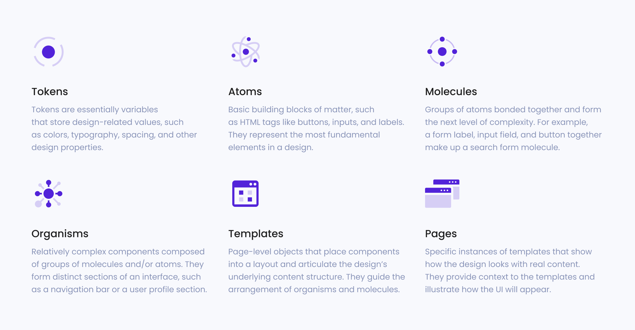
Atomic Design
The atomic design methodology helps in creating a consistent, reusable, and scalable design system. By breaking down interfaces into smaller components, designers and developers can work more efficiently, ensuring that each element adheres to the same design principles and can be easily updated or maintained.
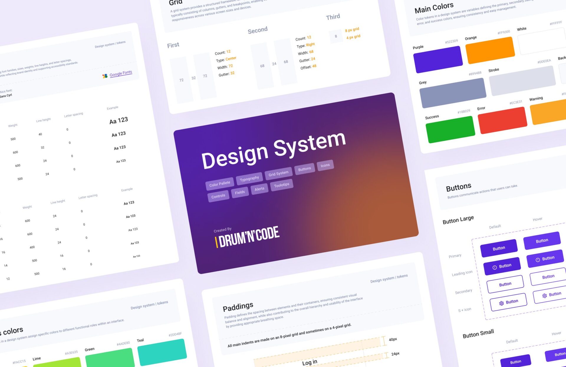
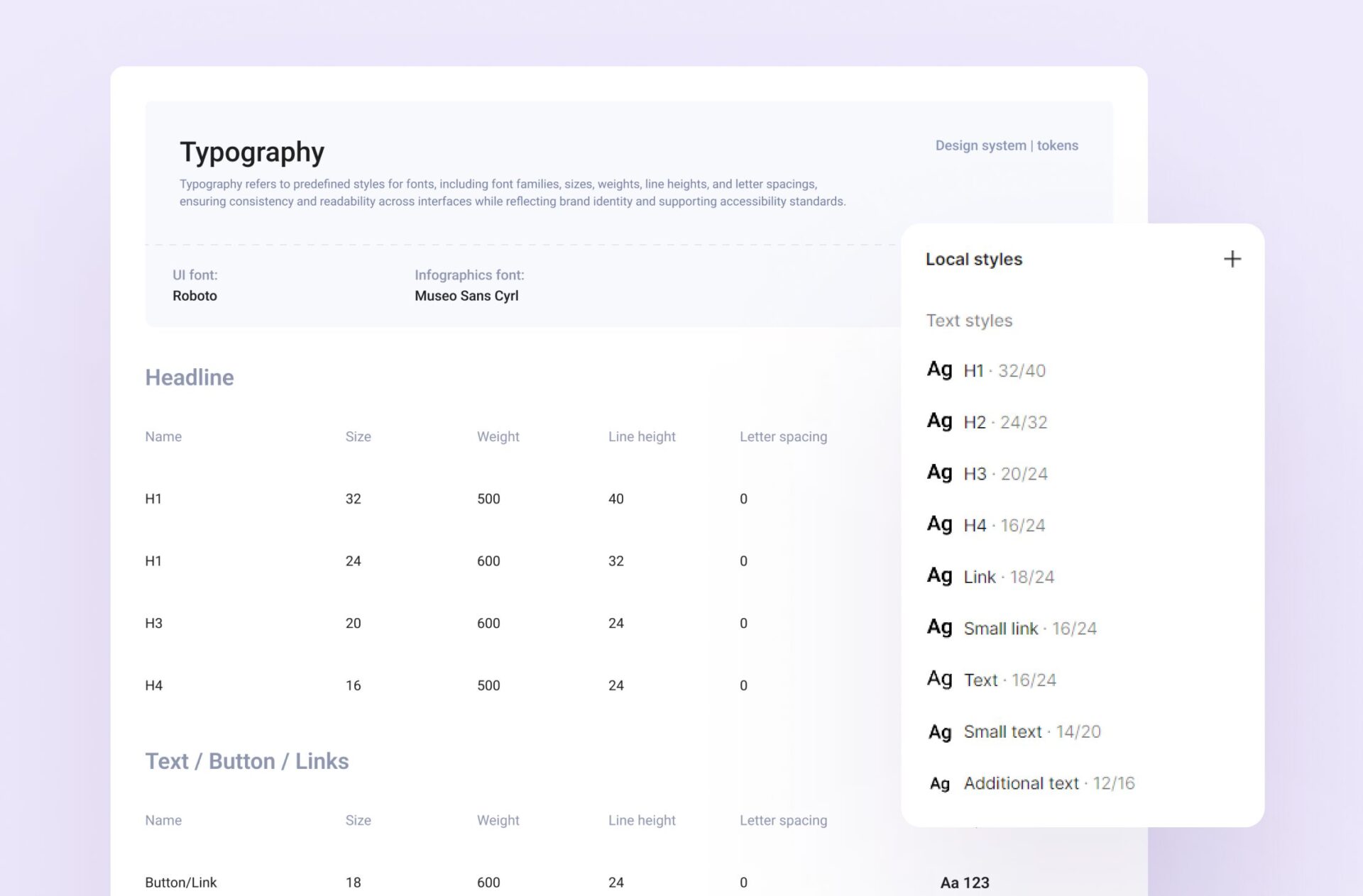
Typography
Typography conveys the brand’s personality and tone, helping to create a memorable and cohesive brand identity. Proper typography also enhances the overall user experience by making interfaces more visually appealing and accessible, accommodating diverse user needs and preferences.
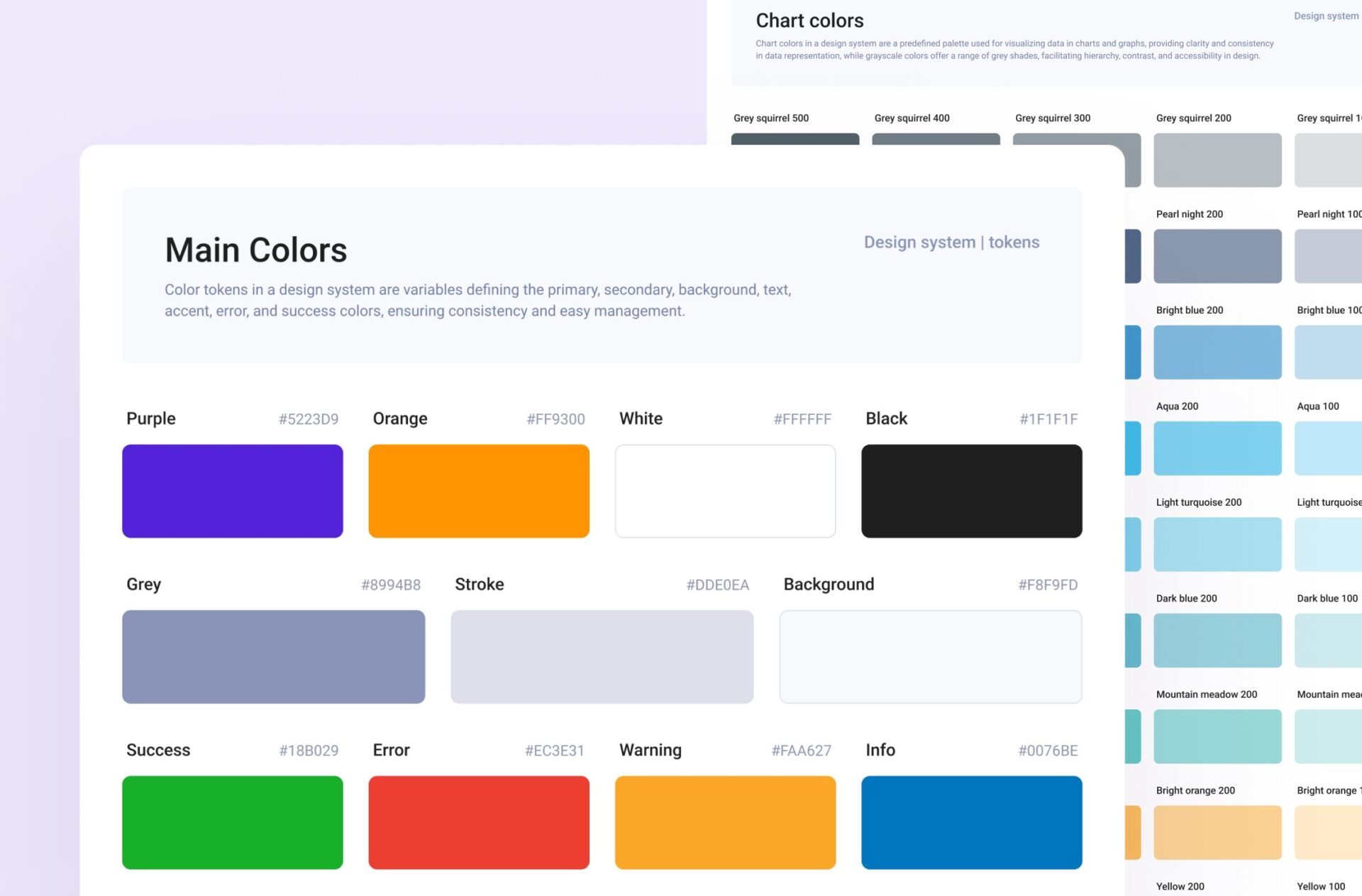
Colors
Colors profoundly affect user perception and emotions, helping to convey the brand’s identity and values. Proper color choices ensure readability and accessibility, making content easier to digest for all users, including those with visual impairments.
Colors also aid in creating visual hierarchy, guiding users’ attention to key elements and actions, and enhancing the overall aesthetic appeal of the interface, making it more engaging and user-friendly.
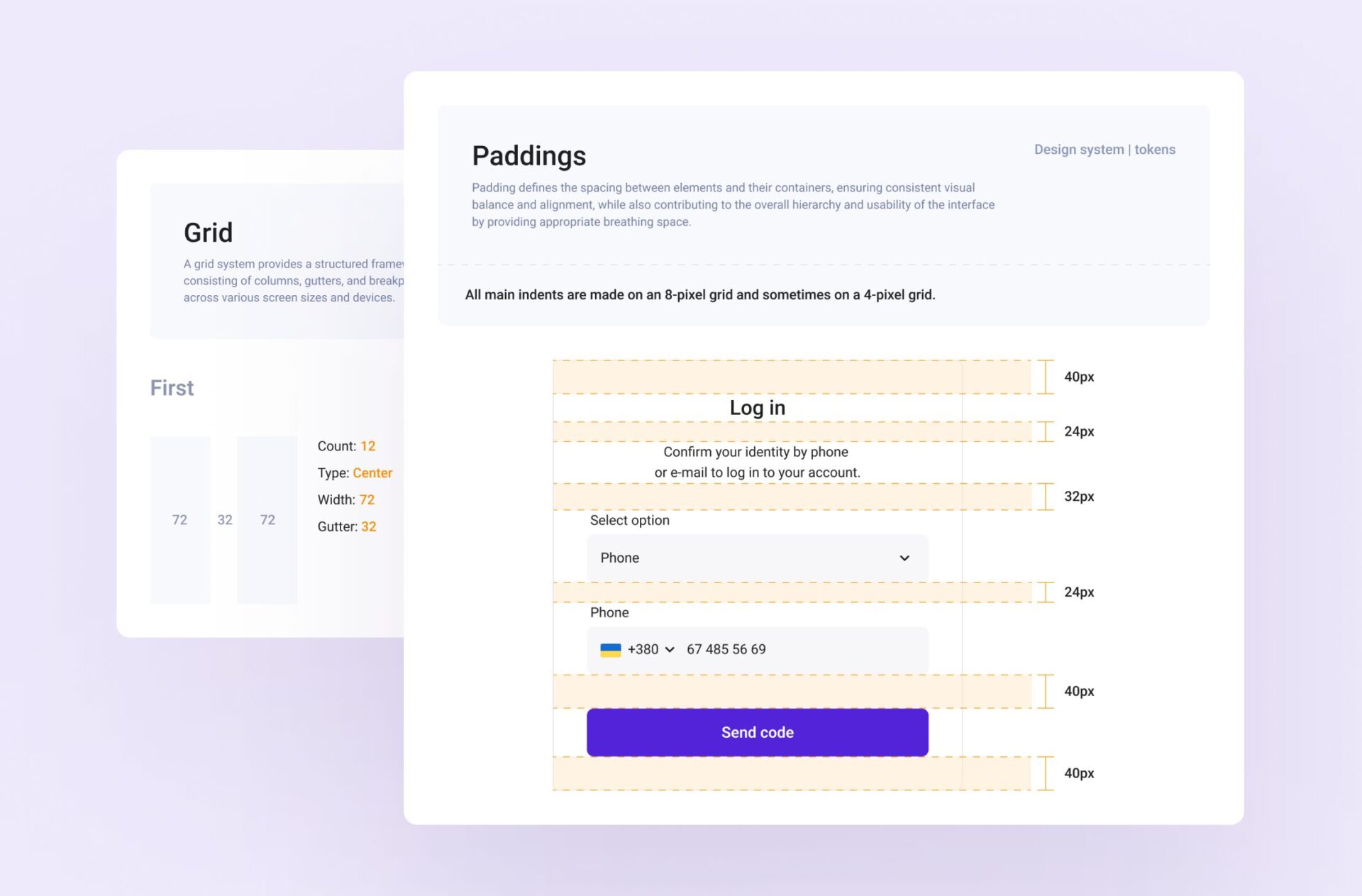
Grid & Spacing
It ensures a structured and organized layout, providing a consistent framework for placing elements. This enhances readability and visual balance by creating clear alignments and proportional relationships between components.
Proper grid and spacing choices facilitate responsive design, allowing interfaces to adapt seamlessly to different screen sizes and devices, while also improving the overall user experience by making the interface more intuitive, accessible, and aesthetically pleasing.
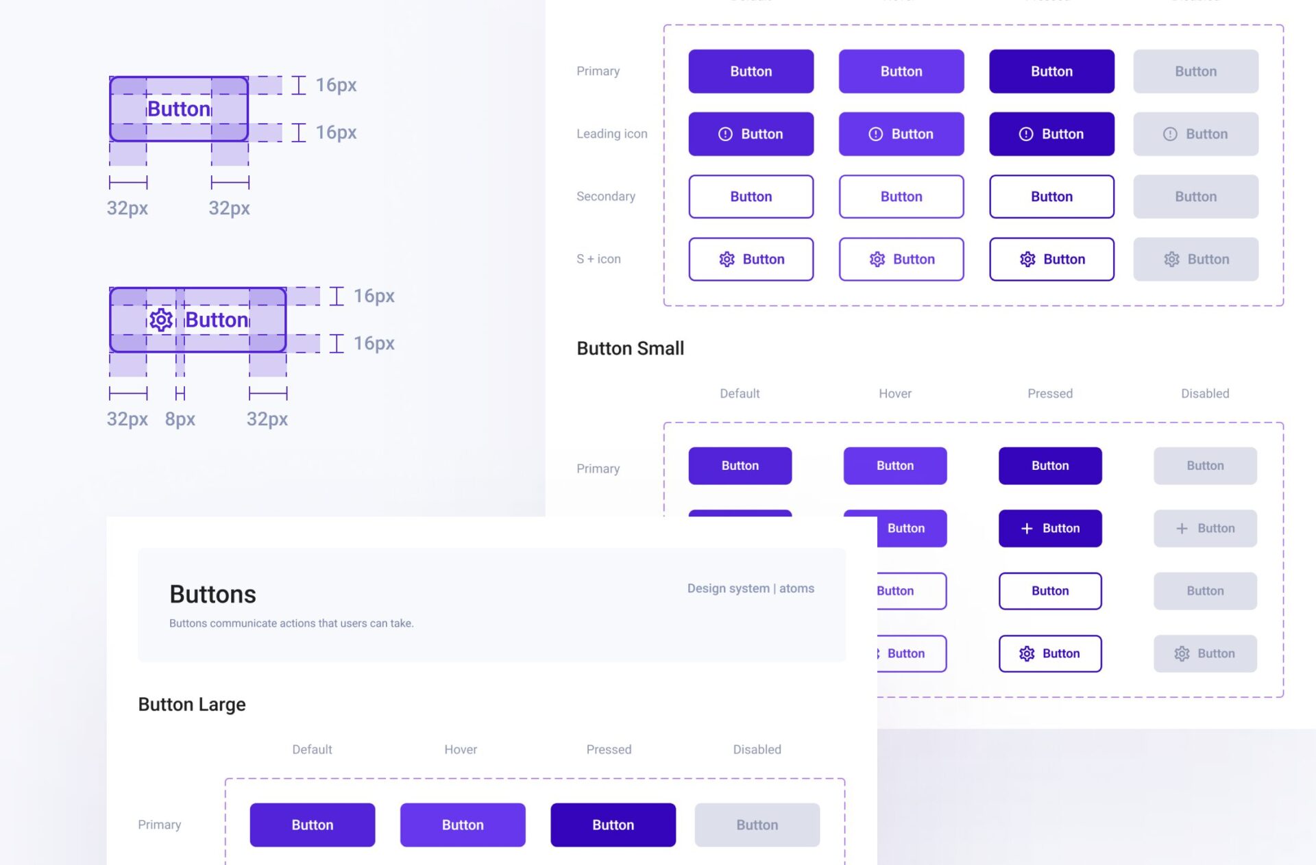
Buttons
Buttons are key interactive elements that drive user actions. Well-designed buttons enhance usability by being easily identifiable and clickable, ensuring that users can effortlessly interact with the interface. Proper button design includes consistent styles, sizes, and states (such as hover, active, and disabled), which helps in maintaining a cohesive look and feel.
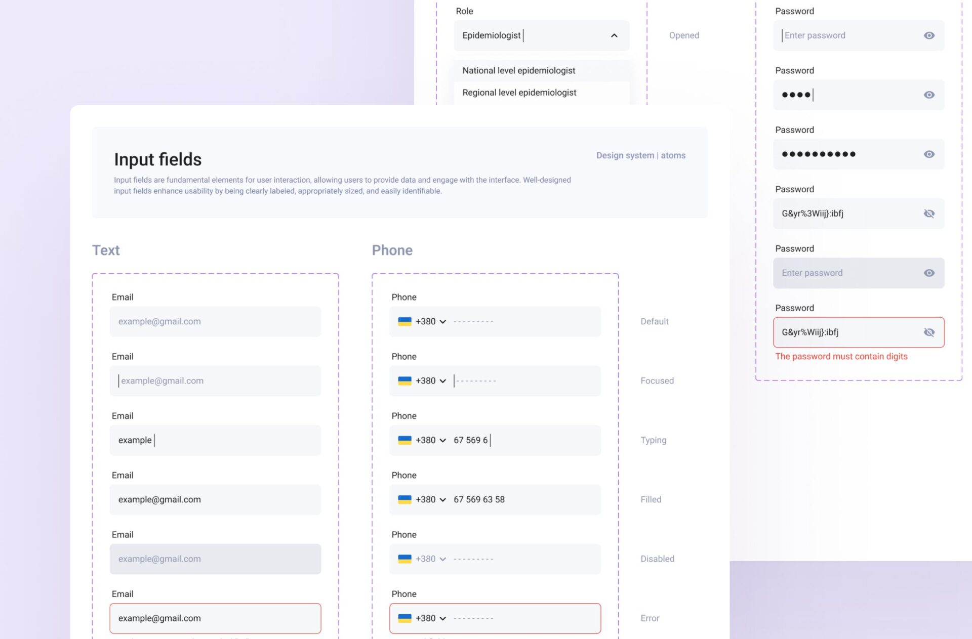
Input Fields
Input fields are fundamental elements for user interaction, allowing users to provide data and engage with the interface. Well-designed input fields enhance usability by being clearly labeled, appropriately sized, and easily identifiable. Consistent styling, such as borders, padding, and typography, helps maintain a user-friendly look across the interface.
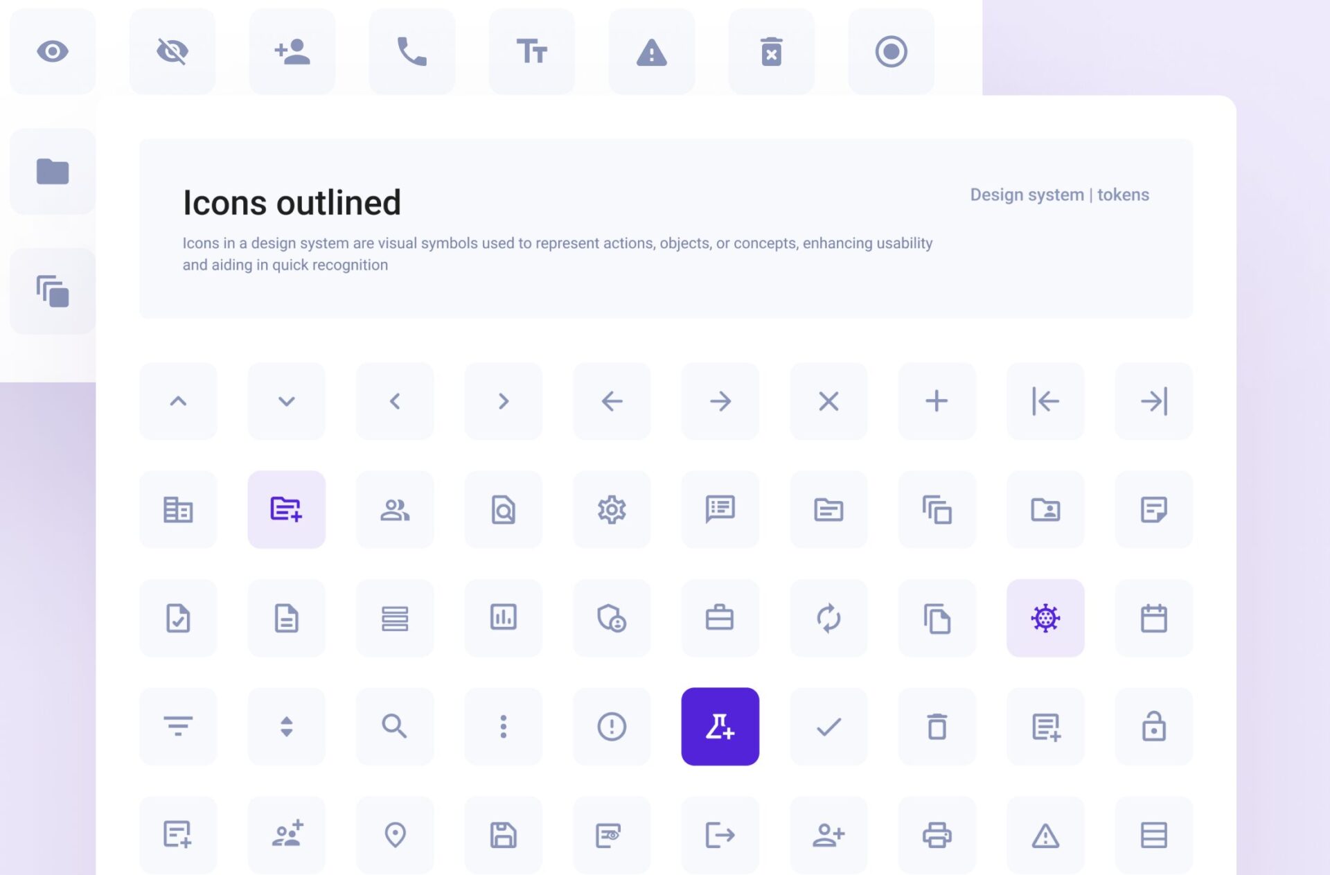
Icons
Icons in a design system are visual symbols used to represent actions, objects, or concepts, enhancing usability and aiding in quick recognition. They ensure consistency, improve navigation, and contribute to a cohesive visual identity across all interfaces.
Other Elements
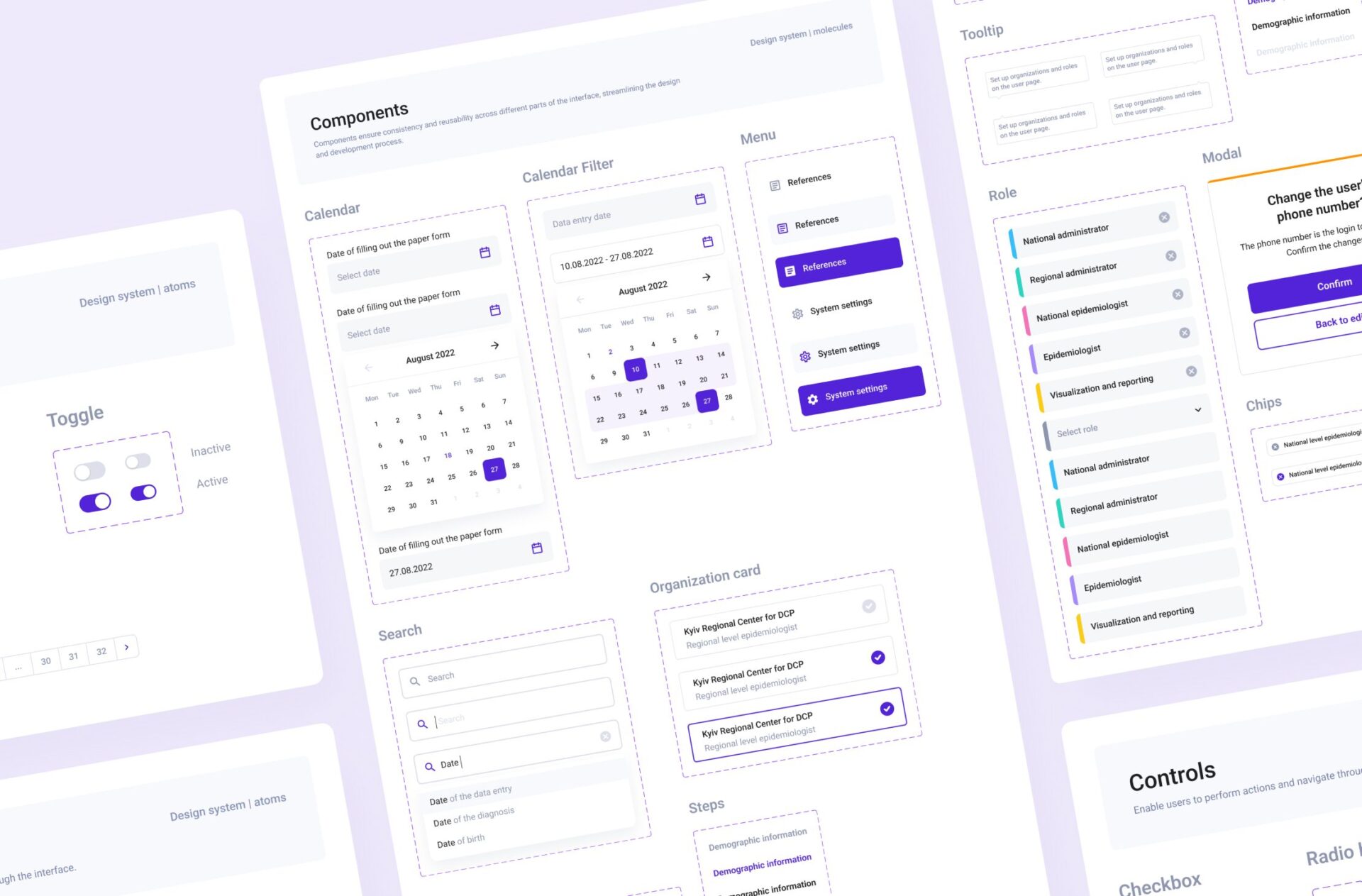
Components form the building blocks of an efficient design framework. They ensure consistency and reusability across different parts of the interface, streamlining the design and development process.
Challenge #1
Scalability
Designing a system that can adapt to new features, products, and changing requirements.
Solution
We built the system with modularity in mind. Used atomic design principles to break down components into smaller, reusable parts. Planned for extensibility from the outset.
Challenge #2
Alignment with Brand and User Needs
Balancing the need for a standardized system with the unique requirements of different products and user needs.
Solution
We conducted user research to ensure the design system meets user needs. Included flexible components that can be customized within defined parameters. Regularly reviewed the system to ensure it aligns with evolving brand guidelines and user expectations.
Our Participation
Team
2 UX/UI designer
Timeline
1 months
Do You
Have an Idea?