Healthy Community
Product
Web Application
Industry
HealthTech
Our participation
UX/UI Design
Client’s aim was focused on creating a unique corporate health and wellbeing program that supports workplaces, teams and individuals to live healthy and fulfilling lives.
The goal was to provide a comprehensive solution for workplace health through a social and gamified portal that encourages both physical and mental wellness. The design would need to facilitate behavior change, support goal setting, and ensure an intuitive experience.
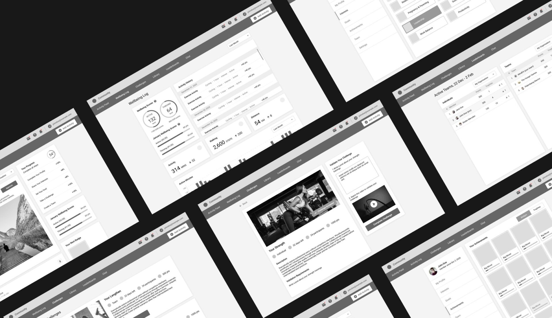
Wireframes
Wireframes provide a visual guide to the structure and layout of a web app. They help in planning the user interface by outlining the placement of elements and the flow of navigation, ensuring that all stakeholders have a clear understanding of the design before moving on to more detailed stages.
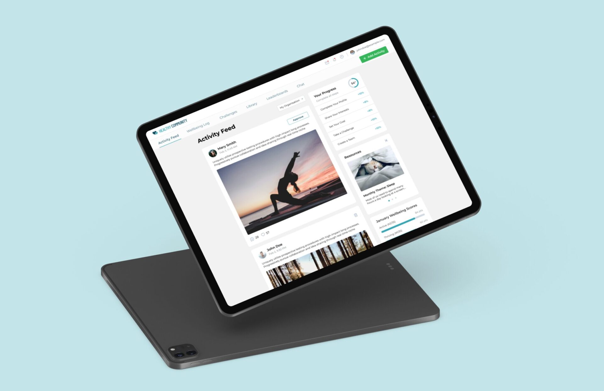
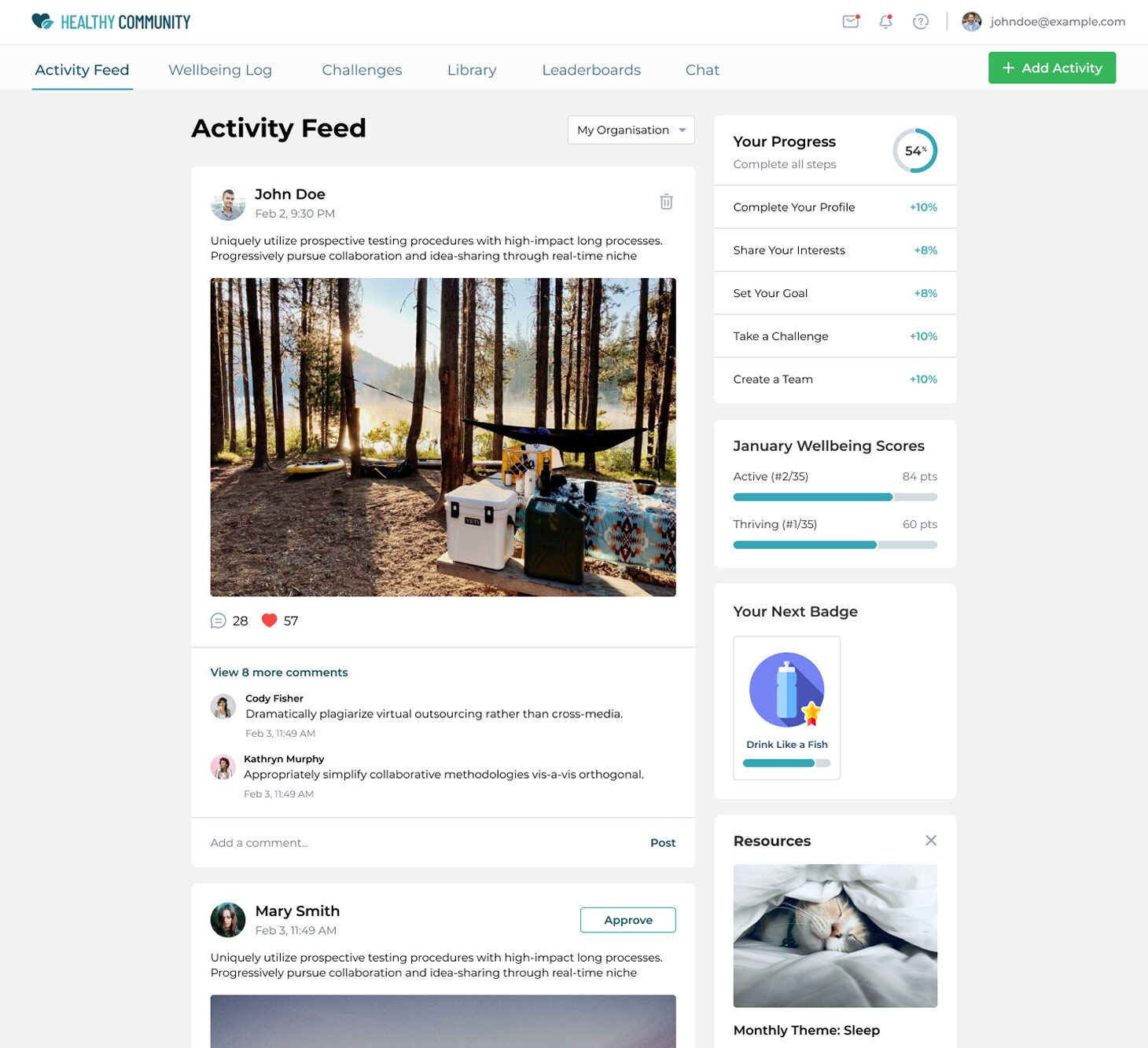
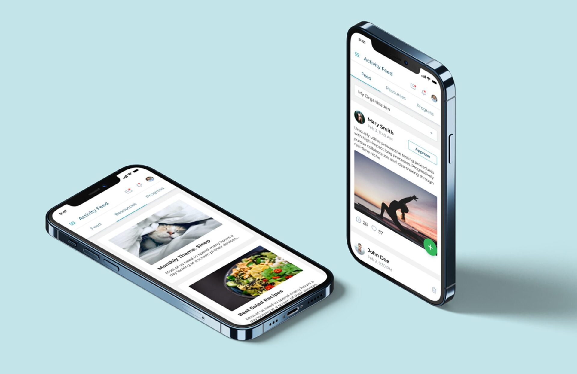
Activity Feed
For an activity page, it’s important to focus on user engagement, clear navigation, relevant content, progress tracking, visual appeal, and feedback mechanisms, with gamification elements to enhance motivation and participation.
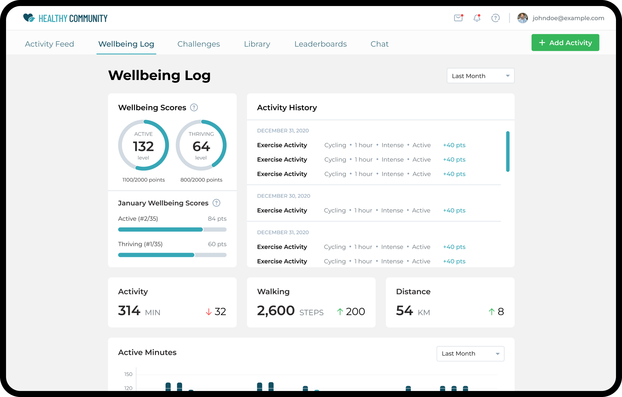
Wellbeing Log
A wellbeing log page should emphasize simplicity and ease of use, allowing users to quickly log their activities and track progress. Key elements include intuitive input forms, clear visualizations of logged data, motivational feedback, and reminders.
Consistency in design, readability, and accessibility are crucial to ensure users of all tech-savviness can benefit from the feature. Engaging design elements, such as progress bars and positive reinforcement messages, can enhance user motivation and adherence to their wellbeing goals.
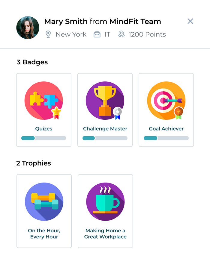
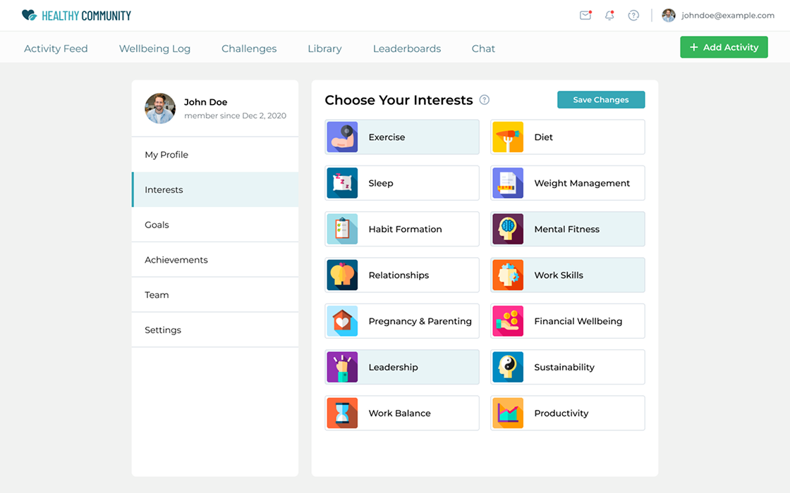
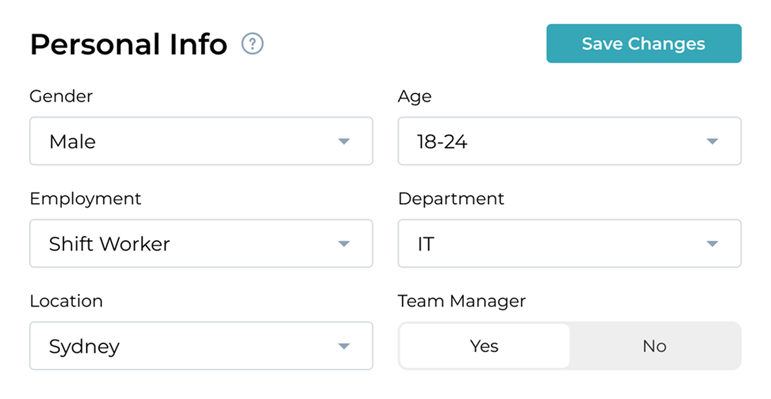
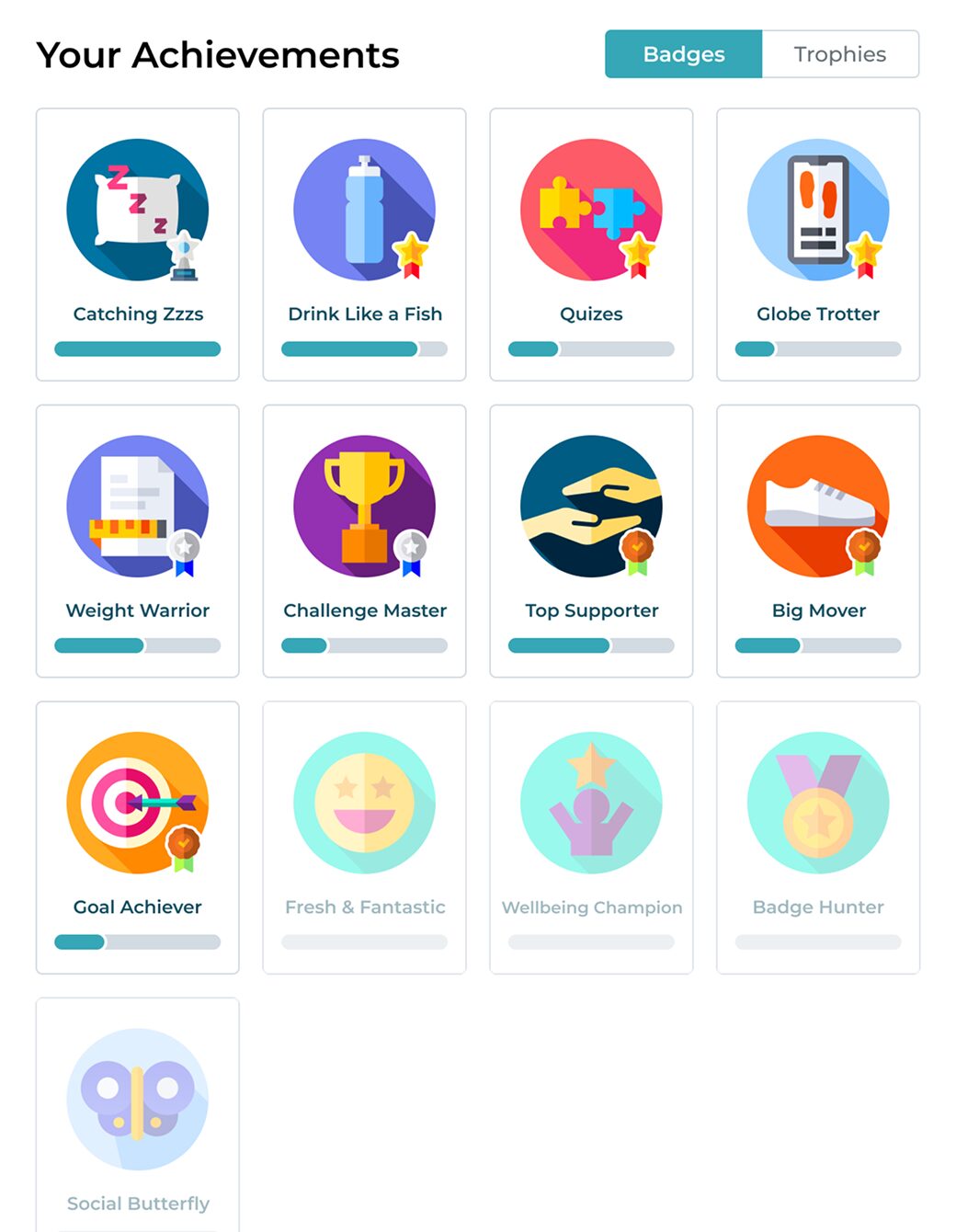
Profile Page
The profile page includes sections for personal information (My Profile), user Interests, Goals, Achievements, Team interactions, and customizable Settings.
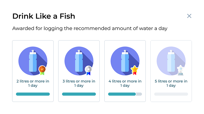
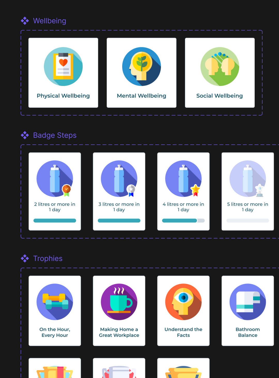
Achievement badges are prominently displayed to motivate users by recognizing their milestones and progress, adding an element of gamification to the app.
This layout ensures a comprehensive, user-centered experience, allowing individuals to track their wellbeing journey, connect with team members, and personalize their preferences effectively.
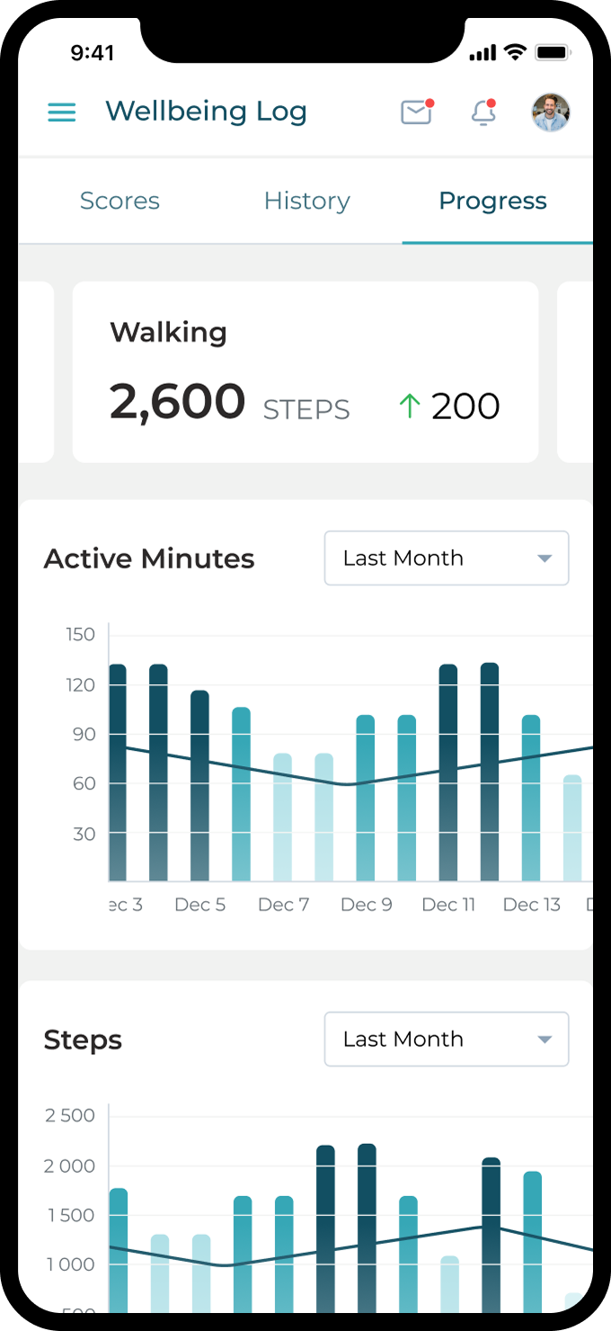
Mobile Responsive
It’s important to have a responsive version to ensure accessibility, optimize user experience across devices, boost SEO, streamline maintenance, future-proof against new devices, and maintain brand consistency.
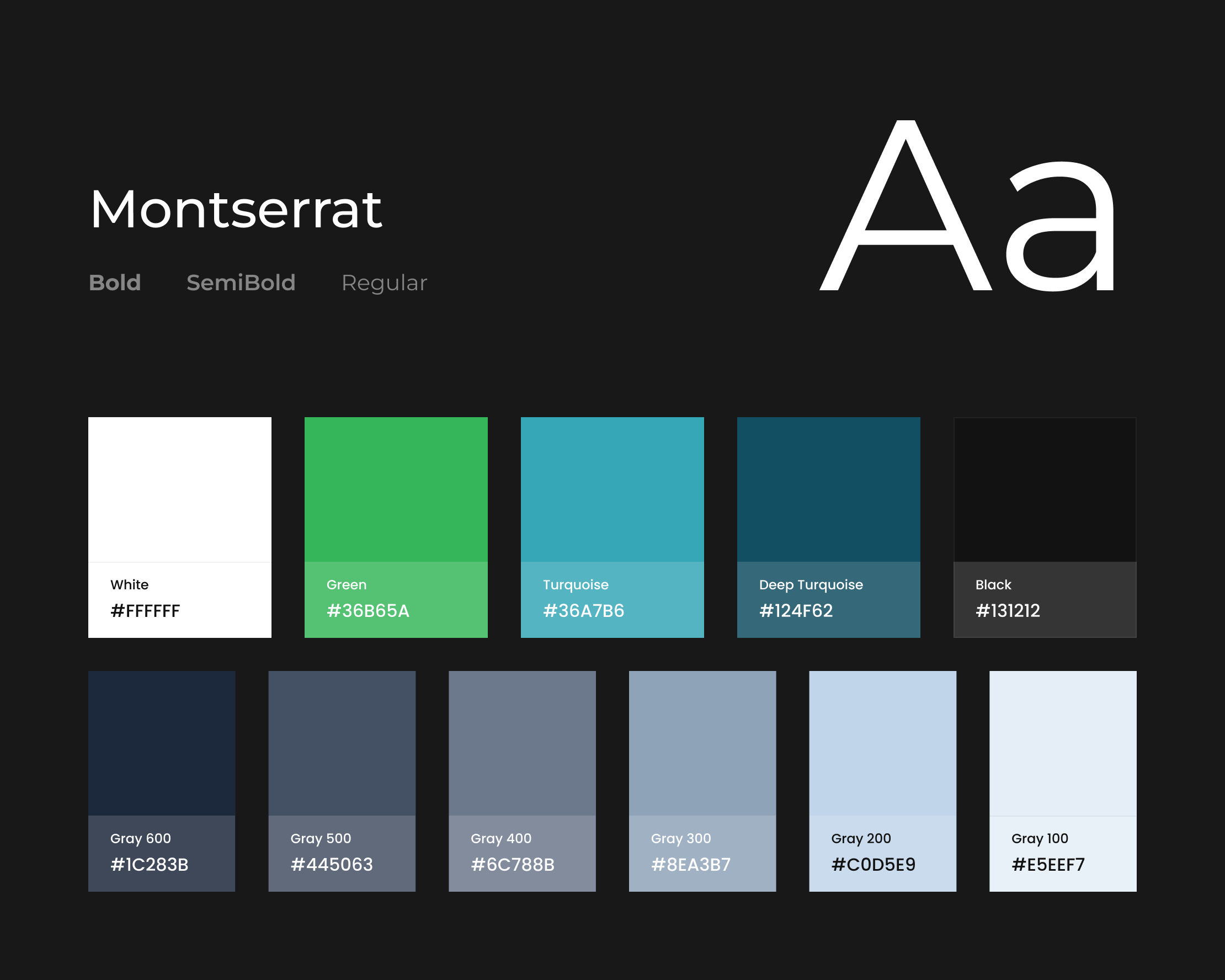
Colors & Typeface
Choosing an appropriate color palette and typefaces is crucial for a healthy social app because it sets the tone, evokes emotions, and enhances readability.
Turquoise, deep turquoise, and green colors convey tranquility, vitality, and nature, aligning well with themes of health and well-being, while carefully selected typefaces ensure clarity and accessibility, fostering a positive user experience.
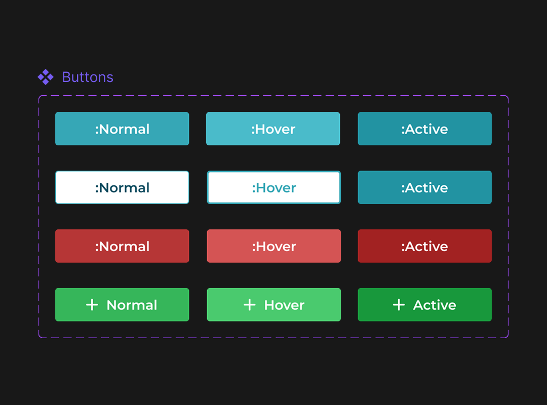
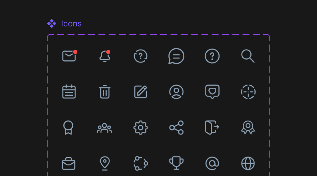
Design System & UI Kit
A design system streamlines collaboration among designers and developers, reduces redundancy, speeds up the design process, and facilitates future updates and iterations. Overall, it enables designers to focus on solving user problems and creating innovative solutions while maintaining design integrity and coherence.
Challenge #1
Feature Complexity
Designing a seamless experience with diverse features like wellbeing tracking, goal setting, and community forums without overwhelming users.
Solution
We used progressive disclosure to introduce features gradually. Created clear navigation paths and intuitive UI elements to simplify interactions.
Challenge #2
Engagement and Retention
Designing features to keep users engaged and motivated for long-term usage amidst competition.
Solution
We implemented gamification elements, personalized recommendations, and social features. Used push notifications and reminders strategically. Continuously gathered user feedback for feature improvements.
Our Participation
Team
1 UX/UI designer
Timeline
1 months
Do You
Have an Idea?