ToCode
Product
Web Application
Industry
EdTech
Our participation
UX/UI Design
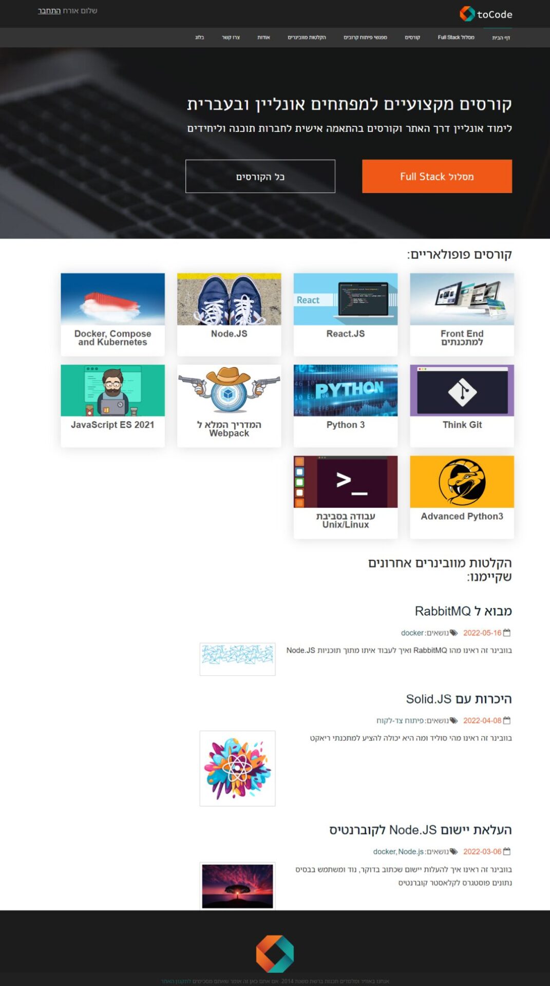
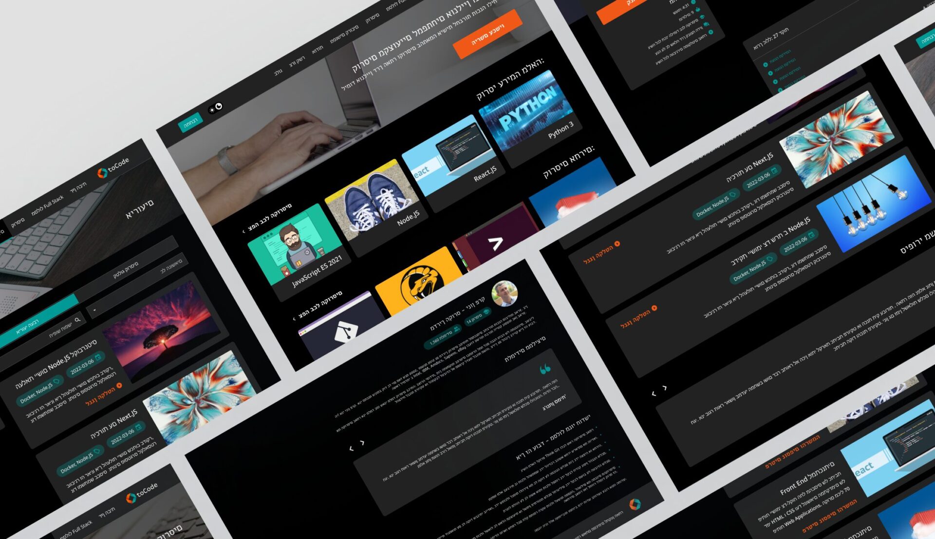
The client’s aim is to revitalize an outdated design for their educational IT courses platform, striving to create a modern, user-friendly interface that not only enhances the learning experience but also increases engagement and motivation among students.
By incorporating the latest design trends and technological advancements, the client hopes to make the platform more intuitive, visually appealing, and aligned with the needs and expectations of today’s learners.
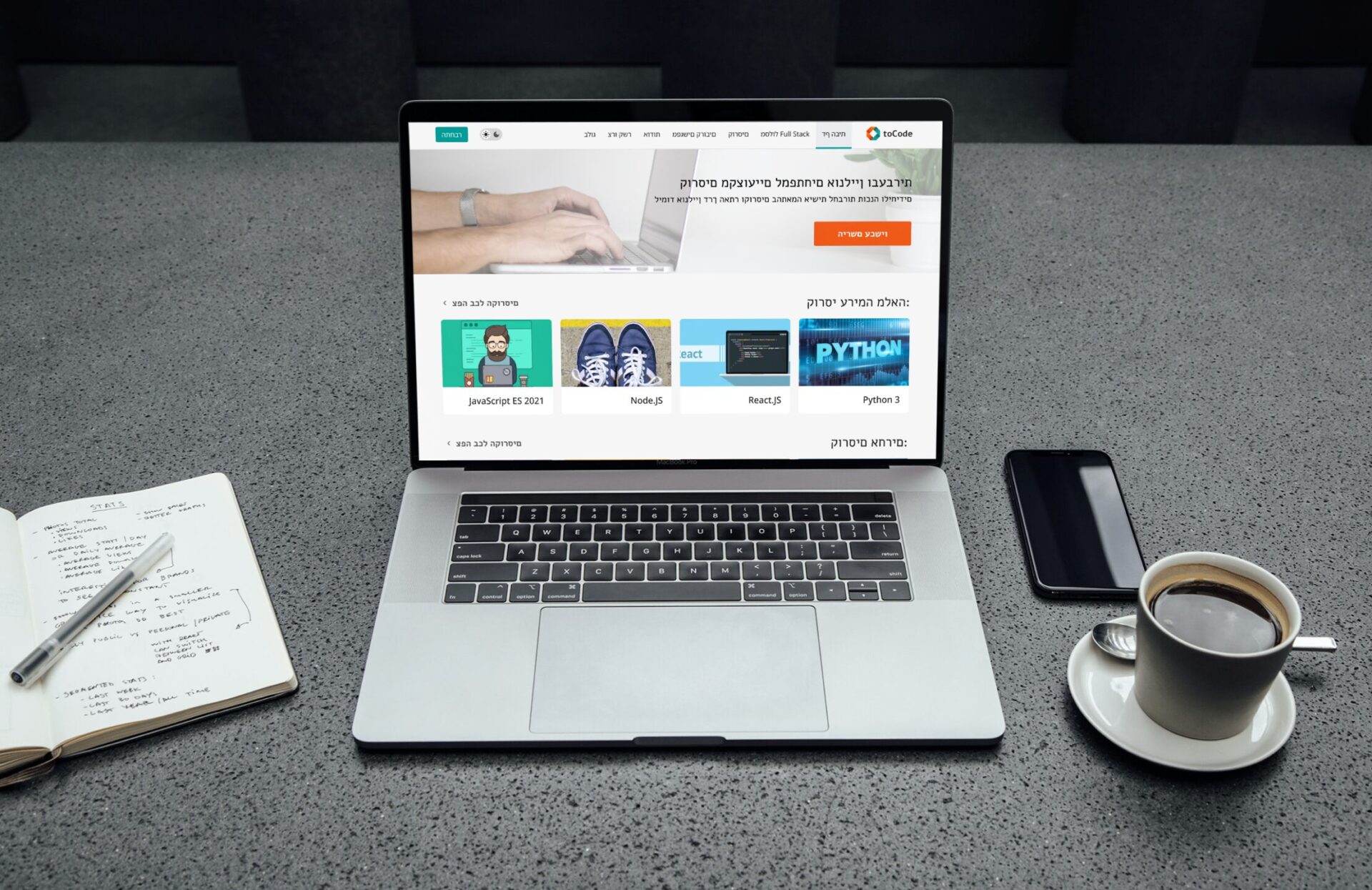
Analyzing the Previous Version
We analyzed the previous version by conducting a comprehensive audit of the interface and functionality, reviewing user analytics, and benchmarking against current design standards. This process helped us identify key pain points, user frustrations, and areas that needed improvement to enhance the overall user experience.
Solutions
We proposed a redesigned layout that prioritizes key information and calls to action, ensuring that users can quickly and easily access the most relevant content. By restructuring the homepage, we aim to create a more intuitive interface that guides users towards their desired destinations, whether it’s browsing courses, accessing resources, or engaging with the community.
Additionally, we focused on increasing readability by optimizing typography, spacing, and contrast, making the content more legible and visually appealing.
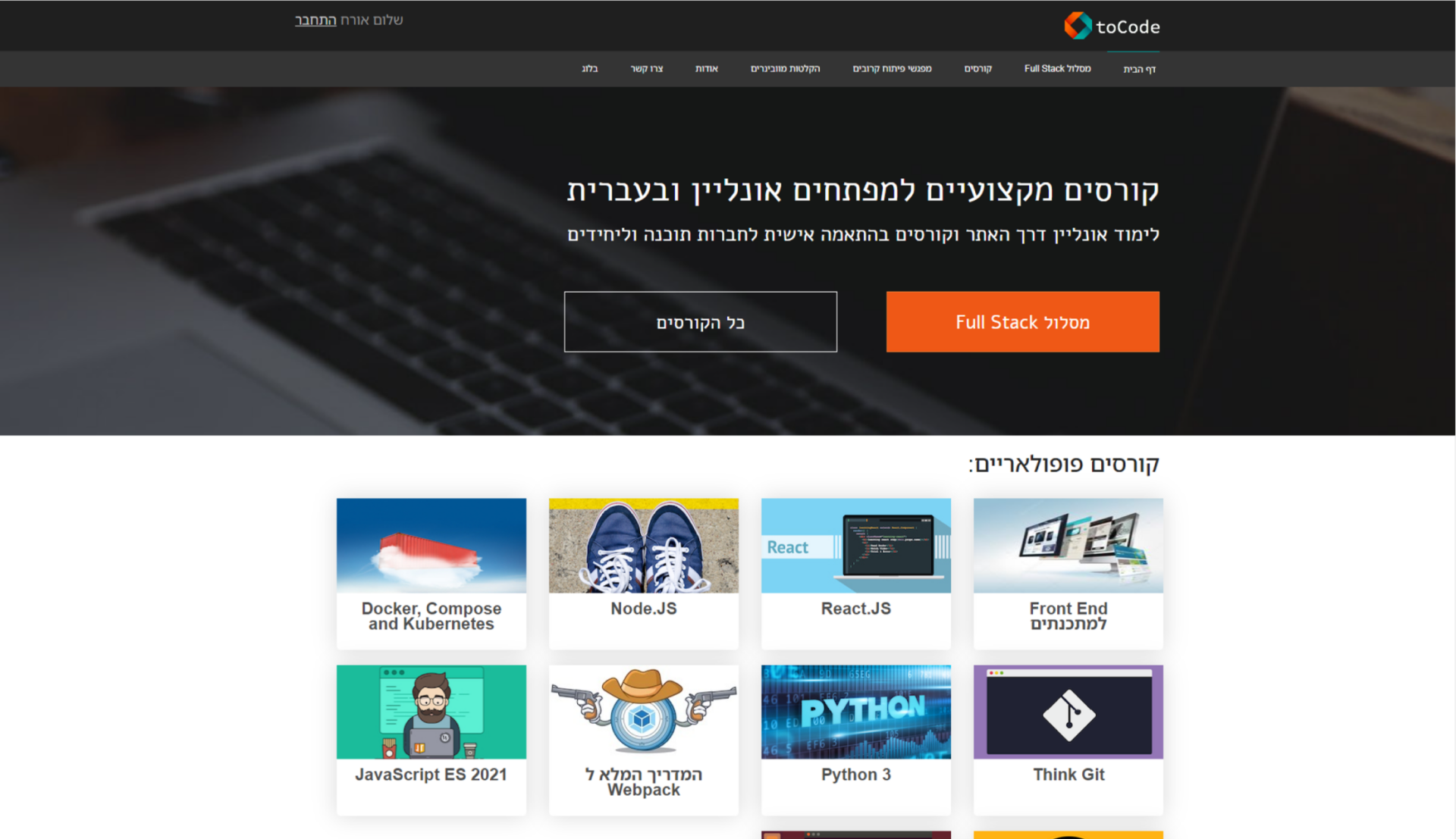
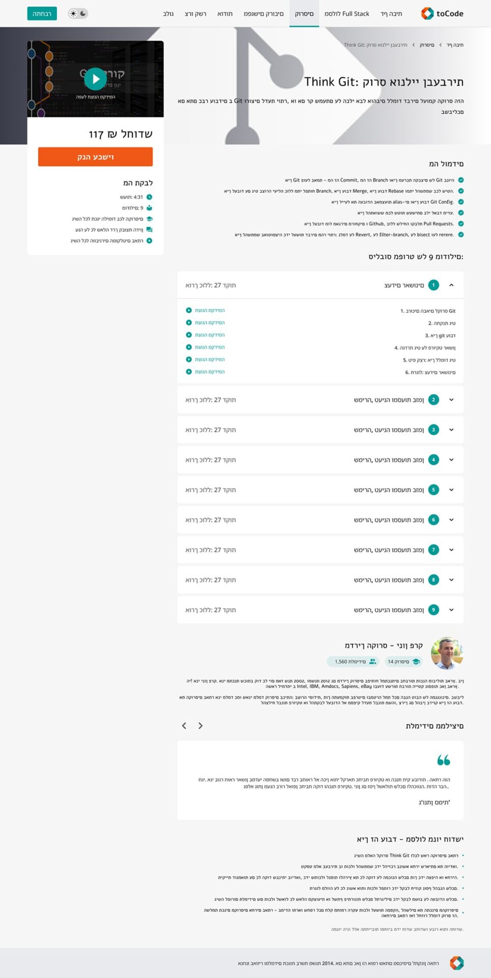
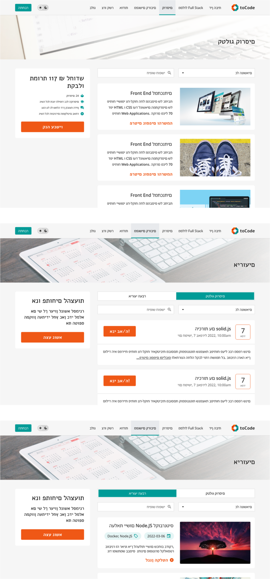
Other Pages
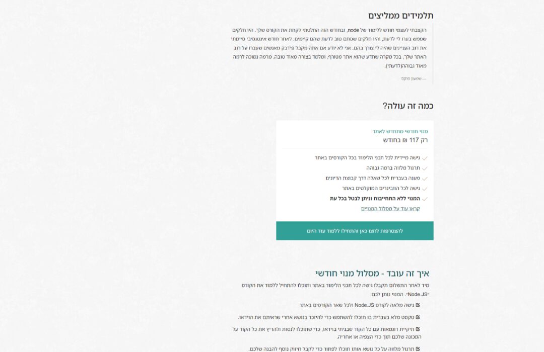
For other pages of the website, our solutions focused on refining the layout and structure to improve navigation and user flow. We redesigned pages to provide consistency across the platform, ensuring a cohesive and seamless experience for users as they navigate between different sections.
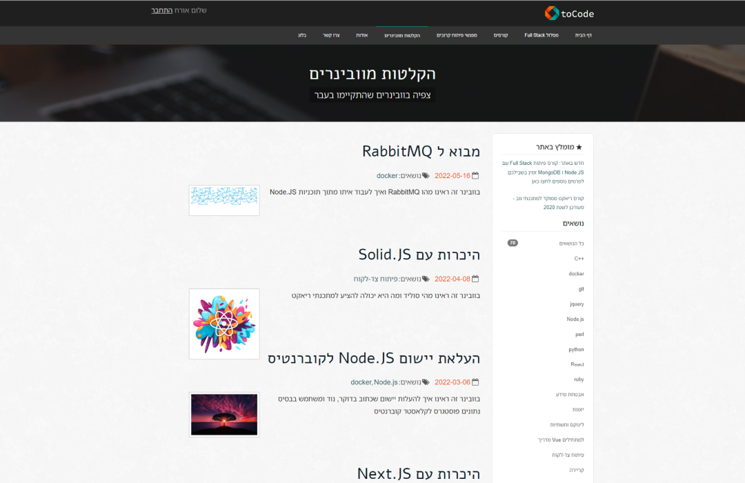
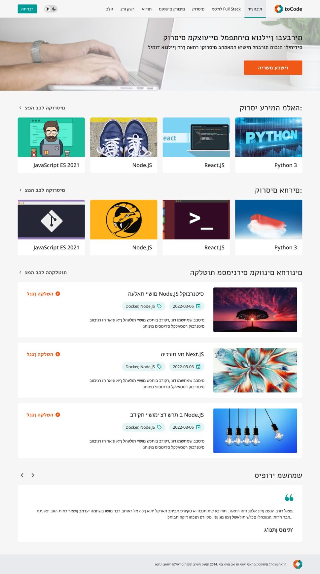
Dark Version
Having a dark version of a website reduces eye strain, improves accessibility, saves energy, offers aesthetic appeal, enhances focus, and adds a feeling of control to users, providing them with a more comfortable and engaging browsing experience.
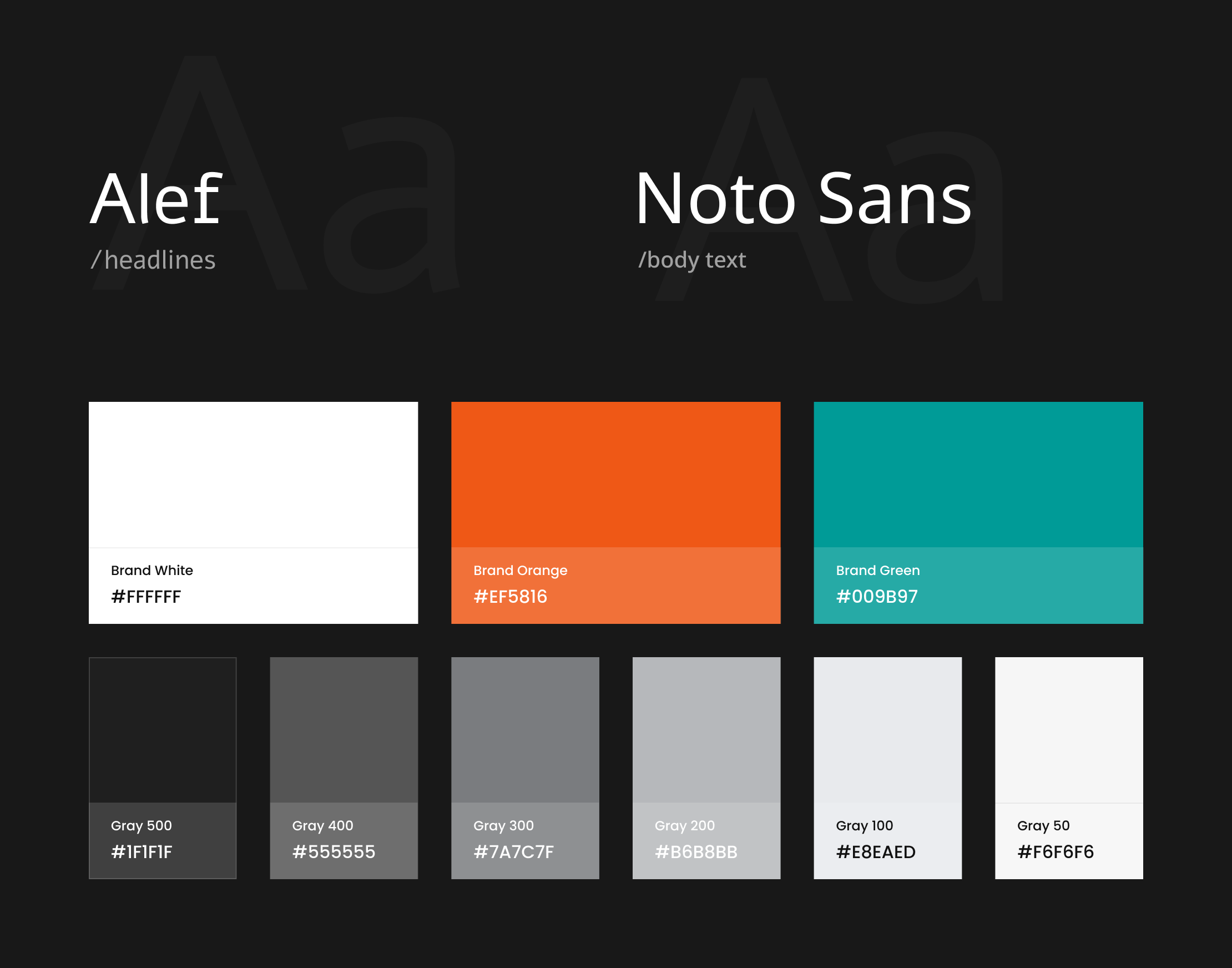
Colors & Typeface
Preserving our branding colors was crucial, but we also aimed to enrich the palette for greater contrast and visual appeal. Similarly, while maintaining primary typefaces, we explored variations to create a dynamic typographic hierarchy, striking a balance between brand consistency and visual impact.
Challenge
Hebrew Language
The main challenge of the project was designing for a Hebrew audience, requiring careful consideration of right-to-left (RTL) language layout and cultural nuances.
Solution
We conducted thorough research on Hebrew typography and user preferences, ensuring proper alignment, readability, and usability. Additionally, we collaborated closely with native Hebrew speakers to validate design decisions and optimize the user experience for this specific audience.
Our Participation
Team
1 UX/UI designer
Timeline
1 months
Do You
Have an Idea?